Justin Havre Real Estate Team
Complete Brand Overhaul
Visual Identity Logo Design Typography Animation The Challenge
When the $4 billion Justin Havre Real Estate Team left RE/MAX, they needed a brand that could stand on its own — without leaning on the credibility their former brokerage’s branding once provided. It had to feel approachable and trustworthy, fit within new brokerage design requirements, and work seamlessly across everything from billboards to digital ads — all without losing the visual recognition built over the last two decades.
The Approach
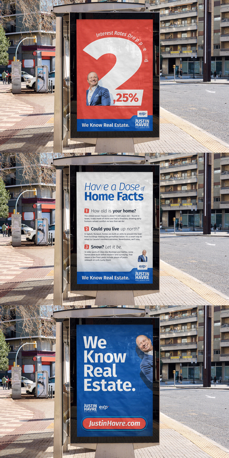
I built an identity centered around Justin’s locally well-known image and a familiar, yet refreshed palette, introducing a blue-dominant ratio with strong, attention-seeking accents. A block-shaped logo beats lengthy wordmarks for recognition, nodding to what real estate is built on — foundations, buildings, and the human urge for stability. The proportions, versatility, and subtle quirks of the Fira Sans typeface make it a great choice for a brand that balances professionalism with approachability.
The Results
Despite being one of the loudest shake-ups in Canada’s real estate industry in recent years, the Justin Havre Real Estate Team’s brokerage switch didn’t damage their brand recognition — it strengthened it. The city-wide ‘We Know Real Estate’ campaign introducing the new identity helped drive significant sales growth and set a solid foundation for the future, allowing them to continue as Calgary’s most recognized real estate team.


