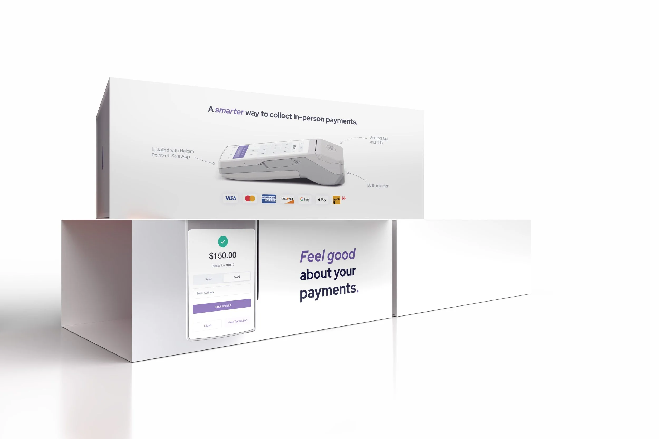
Boxing the Helcim Smart Terminal
Packaging Layout Structural Design PrintOver 1,500 sold and counting*—this milestone product packaging for Helcim was a true team effort. Gina Gong’s custom icon set captured the brand’s vibe, and Manpreet Singh’s 3D renders brought the Smart Terminal to life.
*An unofficial data.
My role? I designed the layout, refined every detail, and led the team to align with Helcim’s vision. Every choice reflected the brand’s spirit: bold, clever, soulful, and built to support small businesses.
The background gradient features three of Helcim’s four primary colors—Purple, Peach, and Yellow—plus one vibrancy boost: Grape. From top to bottom: Purple, Grape, Peach, Yellow.
To create a continuous unboxing impression, the device on the sleeve matches the real one inside, size and angle included.
The hardest part? Finding the right feel. After testing dozens of gradients, I built one around "Grape"—a vibrant, feel-good colour that captured the brand’s energy. With the terminal powered on, the first impression feels clear, modern, and ready to deliver.
One of my sketches from the planning phase.